In 2016, the Clayton Homes corporate headquarters completed a massive overhaul of their employee fitness facilities. This coincided with the launch of the Wellness Department’s new slogan: be more. You can read about our work on the development of the word mark and hype video here. We were asked to develop a unique, visually-impactful sign to welcome employees as they enter the new fitness center. After several weeks of engineering, we installed this “floating” acrylic sign and structural header.
Overlooking the World’s Fair Park and across the street from the Sunsphere, The Tennessean Hotel is downtown Knoxville’s new “personal luxury hotel”.The hotel ownership wanted to incorporate elements throughout the hotel that displayed pride in our region in a modern fashion, and High Resolutions was called on to make that happen.
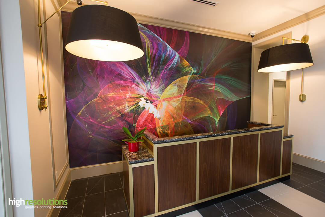
Entering the lobby, guests are immediately greeted with a large wall mural installed behind the reception counter. This artwork was chosen for its bright colors and swirls – a design theme that carried through in other elements.
Wall mural behind reception desk
On each floor, hallways contain custom printed, stretched and framed canvases. A wide variety of artwork was selected, featuring both pure abstract art and satellite imagery of the Tennessee River.The High Res digital design team manipulated each piece of artwork to coordinate the vibrant colors throughout the hotel.
Next, every guest room features a unique floor-to-ceiling custom canvas for each bed. This artwork depicts different sections of the Tennessee River as it winds its way across East Tennessee.In a collaboration of efforts High Res worked with the owner to research and digitize historical drawings, then add color to turn them into the vibrant images you see here. These were also printed to canvas, stretched, framed and installed.Since the 8-foot canvases wouldn’t fit through the door, all materials had to be transported and assembled within each hotel room.
Drawing room graphic
In the “Drawing Room” private bar and dining room, hangs a historical drawing of downtown Knoxville, dated 1886. For this special oversized piece, the talented team at High Res designed and fabricated a custom solid wood frame that would fit the 10-foot wide image, and adjusted the colors before printing to match the warm tones of this elegant room.
As the hotels’ grand opening date approached, High Resolutions installed each of these interior graphics while working side-by-side with electricians, painters, furniture installers and other contractors who were all on deadlines to finish on schedule.But with our team taking care of every part of the process – project management, production, and installation – we were able to accommodate the schedule demands, and finished both on-time and on-budget.
Watch our video below to see more of our work at The Tennessean.
Last week, we shared some of the most important pre-press tips for designers. These were culled from the most common issues and pain points that we see come across our desks. Below you’ll find the tips consolidated in one place with a bit more expansion.
1) Double-check spelling and grammar
Reduce typos by proofreading your your copy…in reverse. This doesn’t mean read your copy with a mirror. This means start reading the last word on the page and move left and up. This forces your brain to look at the words without automatically filling in the between words and letters that you otherwise may have missed.
2) Convert text to paths
Outlining fonts is usually a good idea before sending art to print. Outlining your font ensures that the pre-press specialist or printer operator doesn’t need to have all your fonts loaded onto their machine just to set the file up for production. Unless we need to edit your copy before producing it, we prefer that the fonts already be outlined when you send your print-ready file. The Mac shortcut is CMD+A (to select all copy on page), SHIFT+CMD+O (outline fonts). Save this version with a new name so your original file is still editable in the future.
3) Include linked images
Any time you are sending your native art files (Illustrator, InDesign, etc.) it’s a good idea to make sure any linked graphics are included. Both Illustrator and InDesign now have the ability to package files. Packaging a file puts the native file, fonts and any linked images into one folder. You can then zip the folder and email or upload the file. Illustrator also has the option of embedding links, which simply makes any placed graphics a native part of the AI file.
Image courtesy of 99designs
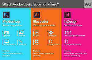
4) Different apps for different uses
Many of us can tend to have tunnel vision when it comes to designing in our favorite applications. However, what’s good in Photoshop isn’t always good in Illustrator and vice versa. This chart helps provide an overview of which Adobe Creative Cloud application is best for different types of work. Following these general guidelines can make your work easier and make for a smoother process when it’s time to print your graphics.
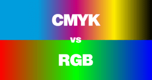
5) CMYK vs. RGB
Although we print the CMYK color space here at High Resolutions, vibrant RGB mixes aren’t entirely out of the question for your project. Whenever you have specific color concerns about a project, ask us how to achieve those specialty colors. This applies to super-vibrant colors like fluorescents, RGB colors, and color-book specifics like those from Pantone.
We hope these tips are helpful to your design process. Remember to follow us on social media for real-time tips and responses to your questions.
Take 462 butcher blocks, 125 feet of wire, 1,900 bolts and screws and our team at High Resolutions. Mix those ingredients up, and you get this amazing wall of Maple, ink and acrylic. How did we do it?
The project started like most projects: with an idea. UT Medical Center came to us with their vision of creating a large display wall that would be a visual masterpiece with a special function. This wall would serve as a historical timeline of the hospital and include the recognition of individuals who had faithfully served the hospital for many years, contributing to its success. The core of our design required custom maple butcher blocks to be fabricated from raw lumber. Each block needed to be finished to the exact same dimensions.
Don’t let the simplistic design, fool you. This wall had to be engineered to support all of the 120+ pound panels that would be installed. To beat all, since the nature of the wall (purpose) is modular and constantly changing by adding new names and timeline events, we had to design a way to remove individual blocks and panels to change the layout over time. This required extensive pre-planning and design engineering until everyone was satisfied with the final solution.
Given the great lengths we went to in order to ensure a successful execution, the production and installation stages went smoothly. After a few days in a secured room to keep the project hidden from the public, the install team emerged with two days to spare before the official unveiling and dedication. With news cameras and hospital staff in attendance, the curtain was pulled back to reveal one of our most ambitious projects to date.
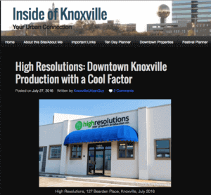
Those who’ve been in the urban Knoxville area for very long have no doubt come across InsideOfKnoxville.com or its author Knox Urban Guy. For the uninitiated, Knox Urban Guy keeps the community abreast of the most significant and interesting events and businesses around the city. His detailed write-ups and excellent photography have all the trappings of a top-notch publication, and we were pleased when he took notice of us after a recent high-profile project downtown. After visiting our shop for a few hours, he wrote an article about our history in Knoxville and the solutions we provide to clients both local and abroad. Click here to read the article and consider sharing it with your networks.
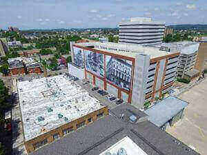
If you frequent downtown Knoxville, you’re likely familiar with the new Walnut Street parking garage between Locust and Walnut Streets. If you didn’t know it by that name, you probably just knew it as the garage with a huge blank wall facing south in downtown. After several months of planning with several parties including the city of Knoxville, the Knoxville tourism agency (Visit Knoxville) and us, we are happy to have been part of turning that huge blank canvas into something amazing – over 230ft worth of historic photographs of iconic Knoxville locations.
The installation is one of the largest in the region, with over 200 brackets and 800 feet of perimeter bracing holding close to 13,000 total square feet of custom printed mesh banner material. The images are intended to stay in place for an extended period, but the permanently installed brackets will let us change out the banners for new ones very easily in the future, and at reduced cost for the client.
The three historic Knoxville images were chosen from the Calvin M McClung Historical Collection here in Knoxville, and selected because of their importance in the history and memory of Knoxville. The first is an image from the late 1920s of the old “Public Hall” building that in one form or another was at the heart of our beloved Market Square for over 100 years. The open Market Square we now know took shape in the late 1950’s after this building was damaged from a fire and removed from the square. The largest, central image is of a view north up Gay Street from the corner of Union and Gay. This photograph would likely be dated from around the same time period, and features a rail trolley in the foreground which ran on Gay Street till the 1940s. The last image on the right is of the Kerns Building that still stands on the corner of Union Avenue at the south end of Market Square. Built in 1875, Peter Kern had a confectionary shop on the 1st floor, an “ice cream saloon” on the 2nd floor, and a meeting space on the 3rd. This building now houses the popular Oliver Hotel.
Below is a short video showing the installation of these mammoth banners.
We were given the opportunity to create a new campaign for the Clayton Wellness Department. Clayton Wellness oversees multiple groups and programs that all have their own brand identities. The design needed to be simple enough to be used alongside multiple programs that fell under the umbrella of the Wellness Department as a whole, but also strong enough to stand on it’s own. Clayton Wellness interacts with employees on a very personal level, seeking to improve growth in all areas of life. This isn’t limited to just fitness, but also applies to their financial, nutritional, spiritual, emotional, and social lives, both inside and outside the workplace.
Our campaign adopted by the Wellness team was called be more. The be more. campaign encourages employees to be more. in all areas of their life. The logo was designed to be used alongside different words that could apply to all of the different areas of life:
To support the new be more. campaign, the Wellness department wanted to make a big statement at their quarterly Teamshare meeting for all corporate employees. We were asked to create a launch video to renew excitement for the Wellness Department and introduce the be more. campaign. We established a concept they loved, and the Wellness Team pointed us to a series of Fitbit commercials that they liked and fit with the concept perfectly. The end result is the below, and the client reaction was our favorite part: “People love it!”
America’s largest homebuilder, Clayton, just introduced a new tagline for their company. “Have it made.” In launching this new message, we created a one-of-a-kind display for their corporate office that incorporated the new slogan while providing a distinct visual nod to their core business: manufacturing and selling homes. Or, as they put it, “Opening Doors to a better life, one home at a time!”More
One of our customers came to us for ideas to promote a healthy eating campaign called “Fuel” to their employees. They liked the idea of using a vintage fuel pump tower as a ballot box where employees could drop their “fuel bucks” in and be entered into a drawing. We took the challenge on and had a concept and design finalized within two weeks. Within three weeks, we were in production.More

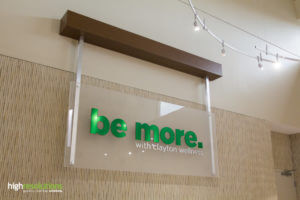
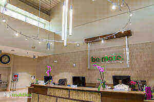 In 2016, the Clayton Homes corporate headquarters completed a massive overhaul of their employee fitness facilities. This coincided with the launch of the Wellness Department’s new slogan: be more. You can read about our work on the development of the word mark and hype video here. We were asked to develop a unique, visually-impactful sign to welcome employees as they enter the new fitness center. After several weeks of engineering, we installed this “floating” acrylic sign and structural header.


 Last week, we shared some of the most important pre-press tips for designers. These were culled from the most common issues and pain points that we see come across our desks. Below you’ll find the tips consolidated in one place with a bit more expansion.
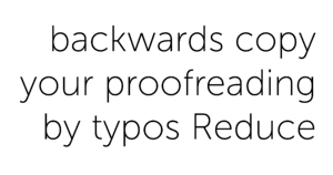 Double-check spelling and grammar
 2) Convert text to paths
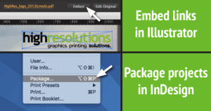 3) Include linked images