
Top Five Pre-press Tips for Designers
 Last week, we shared some of the most important pre-press tips for designers. These were culled from the most common issues and pain points that we see come across our desks. Below you’ll find the tips consolidated in one place with a bit more expansion.
1)  Double-check spelling and grammar
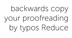
Reduce typos by proofreading your your copy…in reverse. This doesn’t mean read your copy with a mirror. This means start reading the last word on the page and move left and up. This forces your brain to look at the words without automatically filling in the between words and letters that you otherwise may have missed.
 2) Convert text to paths
Outlining fonts is usually a good idea before sending art to print. Outlining your font ensures that the pre-press specialist or printer operator doesn’t need to have all your fonts loaded onto their machine just to set the file up for production. Unless we need to edit your copy before producing it, we prefer that the fonts already be outlined when you send your print-ready file. The Mac shortcut is CMD+A (to select all copy on page), SHIFT+CMD+O (outline fonts). Save this version with a new name so your original file is still editable in the future.
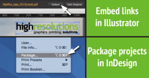 3) Include linked images
Any time you are sending your native art files (Illustrator, InDesign, etc.) it’s a good idea to make sure any linked graphics are included. Both Illustrator and InDesign now have the ability to package files. Packaging a file puts the native file, fonts and any linked images into one folder. You can then zip the folder and email or upload the file. Illustrator also has the option of embedding links, which simply makes any placed graphics a native part of the AI file.
4) Different apps for different uses
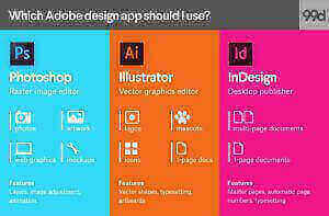
Many of us can tend to have tunnel vision when it comes to designing in our favorite applications. However, what’s good in Photoshop isn’t always good in Illustrator and vice versa. This chart helps provide an overview of which Adobe Creative Cloud application is best for different types of work. Following these general guidelines can make your work easier and make for a smoother process when it’s time to print your graphics.
5) CMYK vs. RGB
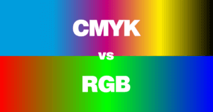
Although we print the CMYK color space here at High Resolutions, vibrant RGB mixes aren’t entirely out of the question for your project. Whenever you have specific color concerns about a project, ask us how to achieve those specialty colors. This applies to super-vibrant colors like fluorescents, RGB colors, and color-book specifics like those from Pantone.
We hope these tips are helpful to your design process. Remember to follow us on social media for real-time tips and responses to your questions.
Twitter
LinkedIn
Pinterest
Instagram
Facebook
Google+