Print has its own language, and if you’re not in the industry, it can feel like a lot to take in. But knowing a few key terms can help you feel more confident when ordering prints, reviewing proofs, or just chatting with your design team.
Here are some of the most common print terms — made simple.
Resolution
It’s in our name, but do you know what it means? Resolution refers to the number of pixels in a digital image. “High resolution” photos generally have more pixels, which means sharper, more detailed images. Low-resolution photos, on the other hand, can look blurry or pixelated when printed.
Aspect Ratio
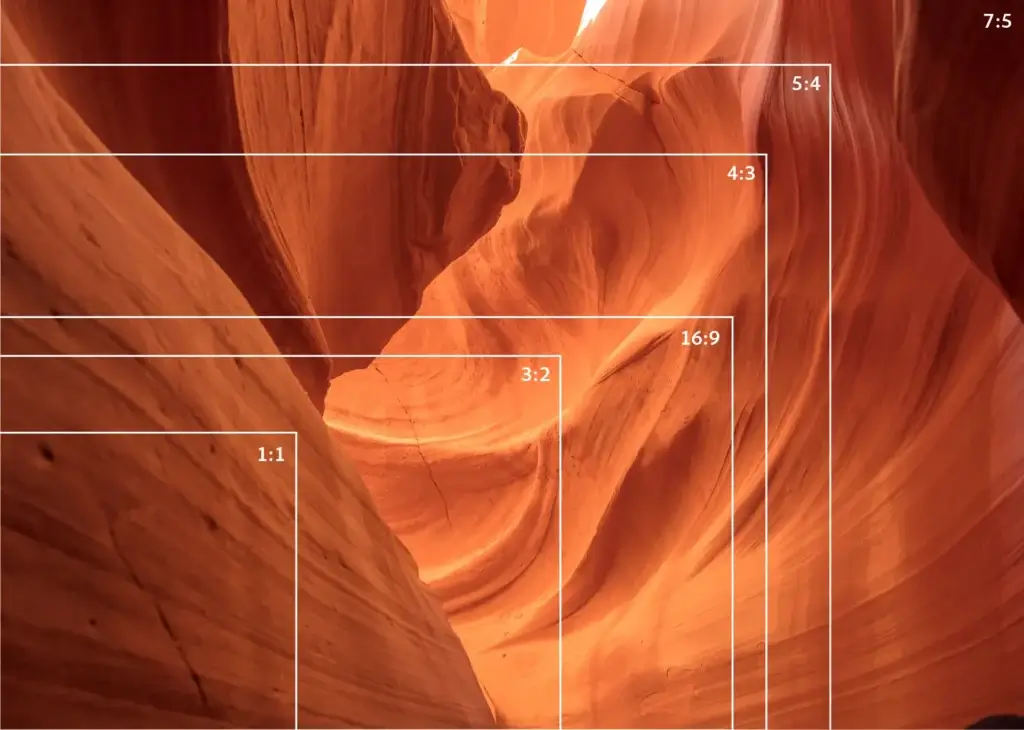
Aspect ratio, simply put, is the relationship between an image’s width and height. When scaling an image up or down, it is important to consider the aspect ratio to ensure the design remains proportional. You’ll usually see it written like 1:1 (a square), 4:5 (portrait style image), or 2:3 (common for posters). If the shape of your design doesn’t line up with the shape of the final product, you’ll either end up with blank space or part of your design cut off.
Scale
Scale is how big your design file is compared to the final printed piece. For example, if something is created at half-scale, every inch on your screen equals two inches in real life. Designers use scale for large prints, like billboards or banners, because some file types can’t be built at full size. As long as the scale matches the final size, the design will print correctly — you just have to make sure the resolution is high enough so the image stays sharp when it’s enlarged.
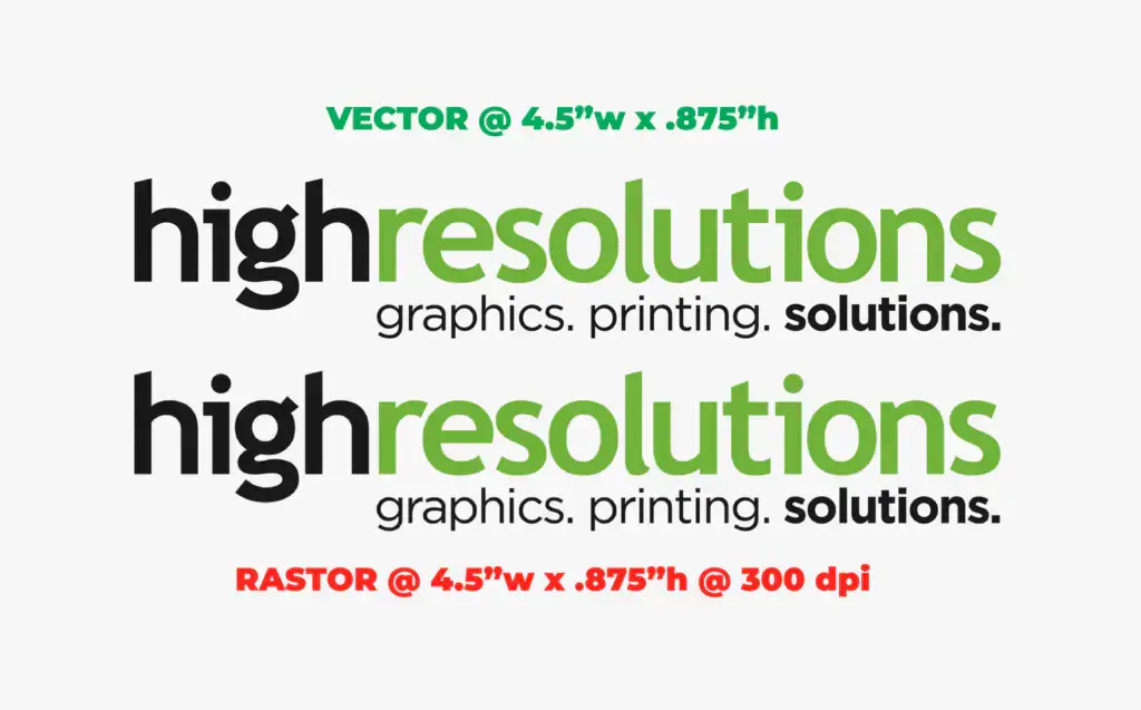
Vector vs. Raster
Vector and raster refer to two different types of image files. Vector files (like .AI or .SVG) are built with shapes and paths, which means they can be scaled up to any size without losing quality — perfect for logos and graphics. Raster files (like .JPG or .PNG) are made of pixels, so if you blow them up too big, they can look blurry or pixelated.
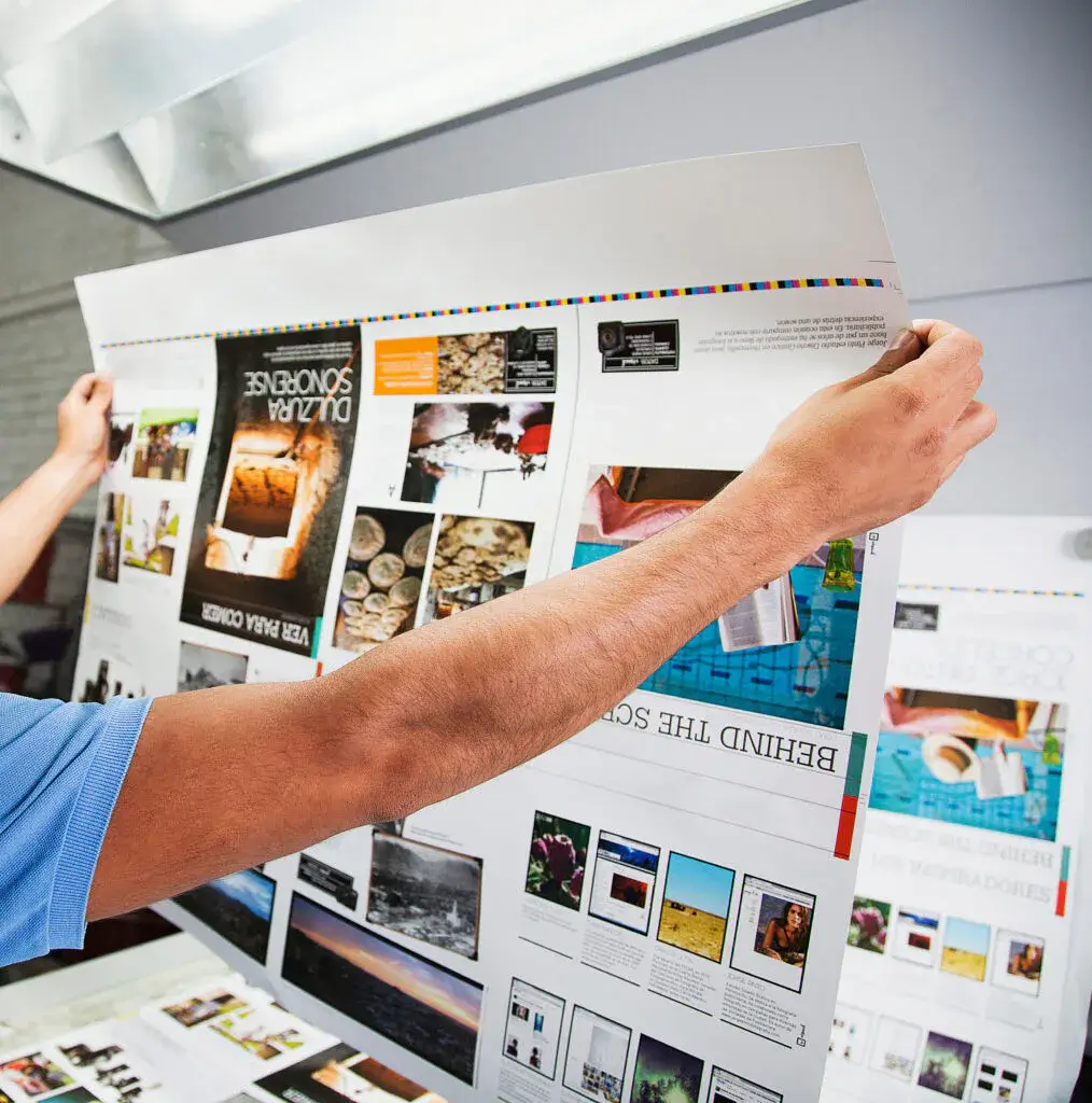
Bleed
It’s not what you think… Bleed is the intentional extension of an image or background color beyond the trim edge of your design. This extra space ensures there are no accidental white borders after trimming. Think of it as a safety net for clean, professional edges.
Safe Zone
The safe zone is the area inside your design where all the important text, logos, or graphics should stay. Think of it as a buffer that protects your content from being cut off during trimming. For example, if you’re designing a brochure, keeping headlines and contact info within the safe zone ensures nothing important gets too close to the edge — and everything stays clean, readable, and professional.
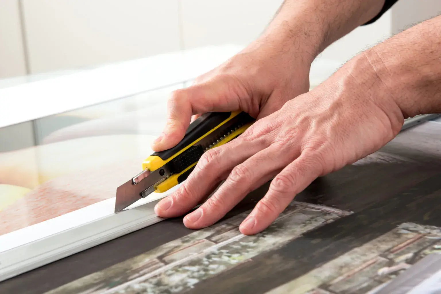
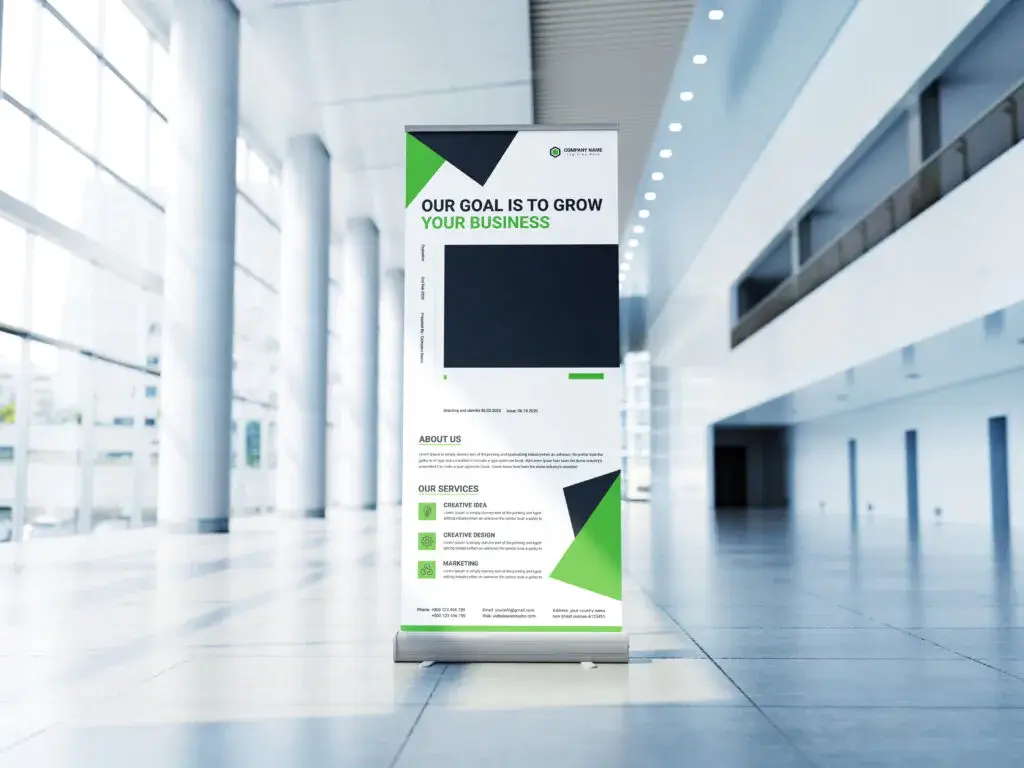
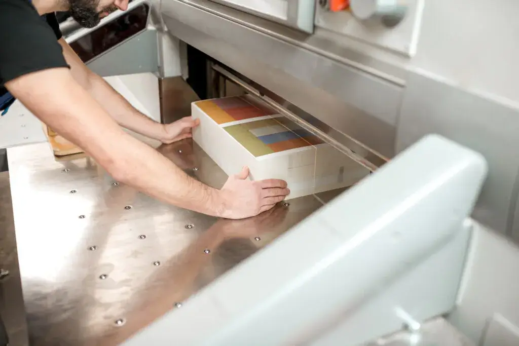
Trim Size
Trim size is the final size of your printed piece after all the cutting is done. For example, if you order a banner that’s 8′ x 4′, that measurement refers to its trim size. Anything that extends past the trim edge will get cut off — which is why bleed and safe zones are so important.

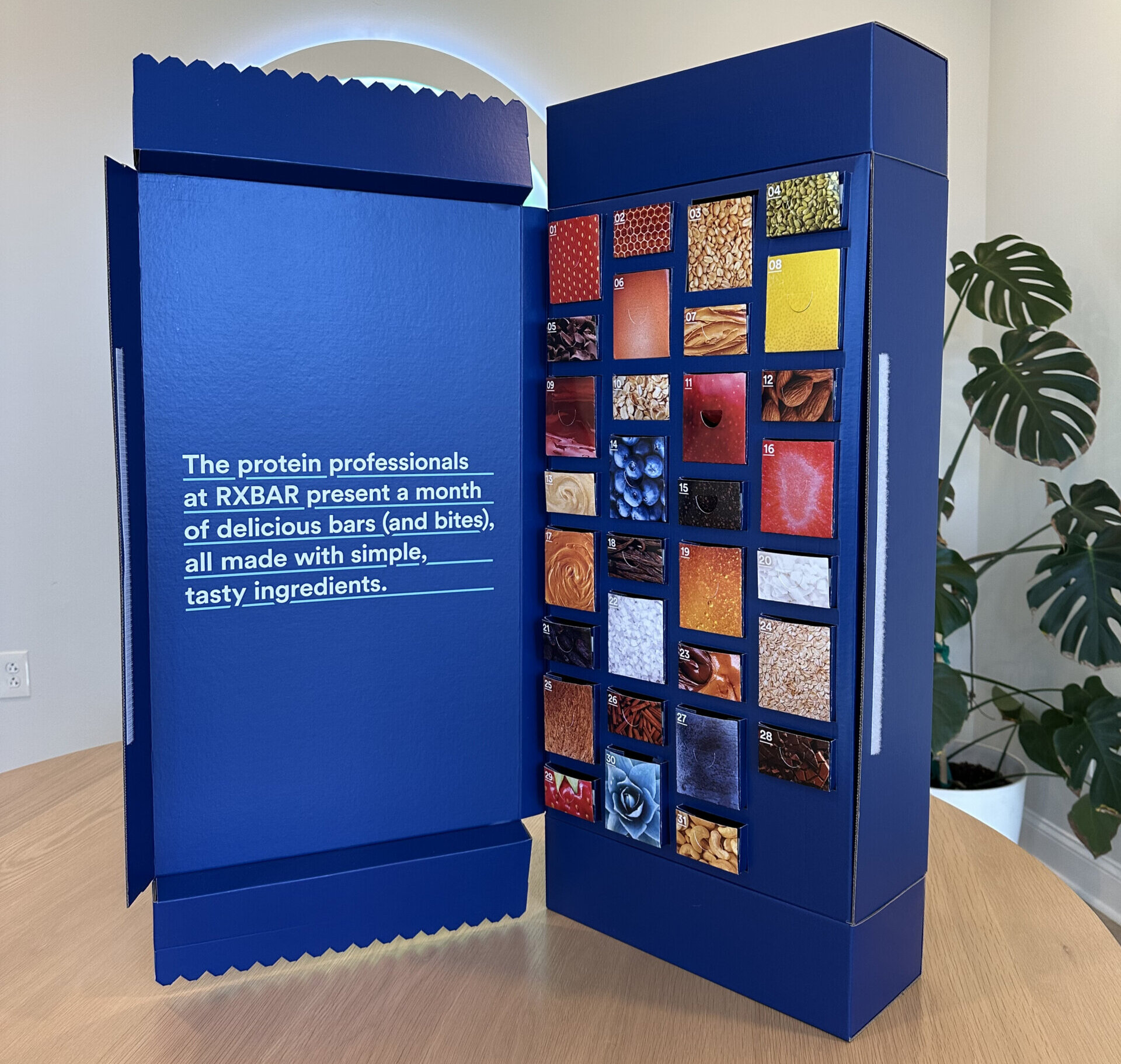
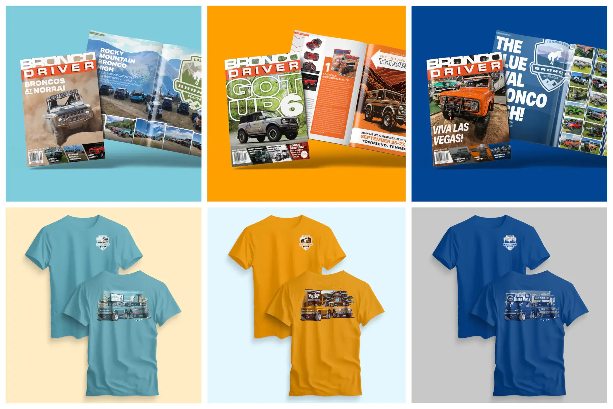
Stock
Stock is just the print-world word for the material you’re printing on. Paper is the most common, but stock can also mean cardstock, vinyl, or other specialty materials. Different stocks can totally change the look and feel of a project — glossy, matte, textured, or even transparent.
Proof
A proof is like a sneak peek of your project before it goes to final print. It can be digital (a PDF you review on your screen) or physical (a sample print). Proofs let you double-check colors, spelling, and layout so there are no surprises in the finished product.
Now you’re ready to talk shop like a pro! And if you ever get stuck on a term, don’t worry — that’s what we’re here for. We’ll handle the jargon so you can stay focused on bringing your vision to life.